Unitil, (unitil.com), a provider of natural gas and electricity to New England customers, has taken steps to improve the accessibility of its website for users with visual impairments.
"It’s a very refreshing and positive thing to go to a website that’s accessible... There are some individuals that are vision impaired who just don’t want to go on the web because they get lost on a site.
Unitil Customer, Dana Trahan
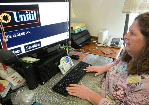
The newly redesigned website includes several features that will enhance the experience for Unitil customers like Dana Trahan, who is legally blind as a result of a brain tumor discovered in 2010 that damaged her optic nerves.
Trahan, who lives in Exeter, N.H., has been forced to find ways to adapt to her condition and now uses a screen reader, which is assistive technology that reads the text on a screen to make it easier for someone who is blind or has other visual impairments.
She said she was pleased with the recent website changes.
“It’s a very refreshing and positive thing to go to a website that’s accessible. It’s like a big sigh of relief for someone like me. There are some individuals that are vision impaired who just don’t want to go on the web because they get lost on a site,” said Trahan, who doesn’t use a mouse and instead relies on a tab key or arrow keys to move around websites and a spacebar to open links.
The Carroll Center for the Blind of Newton, Mass., a national leader in vision-related services for individuals who are blind or have low vision, assisted Unitil with the redesign along with Matter Communications, a brand elevation agency unifying PR, creative services, digital marketing and strategy.
The accessibility improvements have made the site screen reader and keyboard navigation friendly. Among the changes, keyboard users will notice enhanced tab functionality to navigate through the website from top to bottom. For those using screen readers, the site now has enhanced code behind content to clearly define the structure of headings, links and body text along with the use of alternative text on images so users have a description of all the visual elements an individual who is sighted can see.
Visual indicators were added to clearly note areas of focus when using a keyboard to navigate; however, the color contrast ratio of that indicator will be enhanced in the future.
The site also includes accessibility-friendly fonts to improve the experience for users with low vision and ensures all text meets color contrast ratios so that it’s clearly visible and legible.
“It’s difficult for someone without these challenges to understand just how negatively they can impact their web experience. The improvements we’ve made are vital to our customers and other users of our website with visual disabilities,” said Unitil Media Relations Manager Alec O’Meara. “We were fortunate to have the Carroll Center on board to share their expertise with us as we worked to make our site more accessible to all. In fact, one of the developers from the Carroll Center was actually visually impaired and worked with his wife to review the site from multiple first-hand user experiences.”
The Carroll Center began reviewing the site in early 2019 to find examples of accessibility and usability issues that did not conform with success criteria requirements of the Web Content Accessibility Guidelines. They included images without meaningful alternative text, a lack of visible focus indicators, inaccessible complex tables, a lack of video transcripts, and using page headings out of their intended semantic hierarchy.
Bruce Howell, the Carroll Center’s accessibility services manager, stressed the significance of Unitil’s improvements.
“Websites or applications can look identical, whether they have incorporated appropriate accessibility strategies or not, yet the experience for someone with a disability can be dramatically different when companies have not built accessible design and coding into it,” he said.
Those who are blind or have other vision impairments are often the most impacted by websites that aren’t easily accessible, but people with other disabilities face struggles, too.
Howell said Web Content Accessibility Guidelines aim to address the needs of people with all types of disabilities, so when the Carroll Center provided accessibility support to Unitil, it also evaluated, tested, and recommended remedial solutions to address those other needs as well.
The overall goal was to find ways to improve the experience for users with no vision to low vision, those with hearing difficulties and others with cognitive challenges.
“Accessibility is something that needs to be built into all stages of web design, development, and quality assurance efforts. Due to constantly changing technologies, web browser capabilities, and the devices that people use for their online interactions, every company needs to continually learn and adjust their strategies to be sure they are meeting the needs of all their customers. Building internal capacity is a great approach, but there are times when you will need the perspective of an outside consultant who can look at what you have designed and built with fresh eyes, and by including those who are daily users of assistive technologies for their invaluable input, too,” Howell said.
Unitil is continually reviewing and enhancing its website from a user-experience standpoint and will make accessibility a key focus as the website grows in the future.
“We hope the changes we’ve made will inspire other businesses to take a similar approach as they look to improve their sites,” O’Meara said. “We believe in continuous improvement and we’re already looking at other ways to further increase accessibility.”


